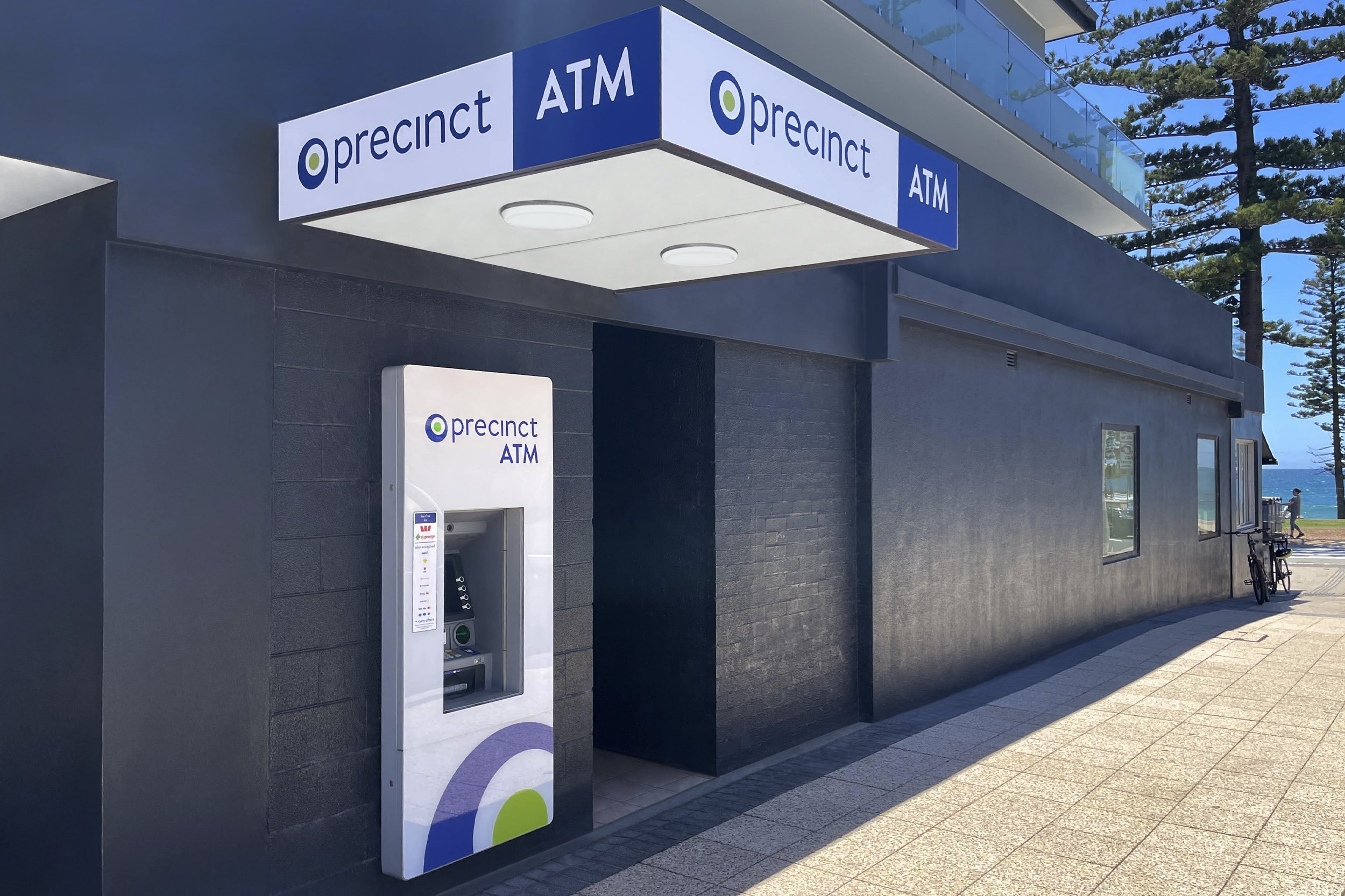
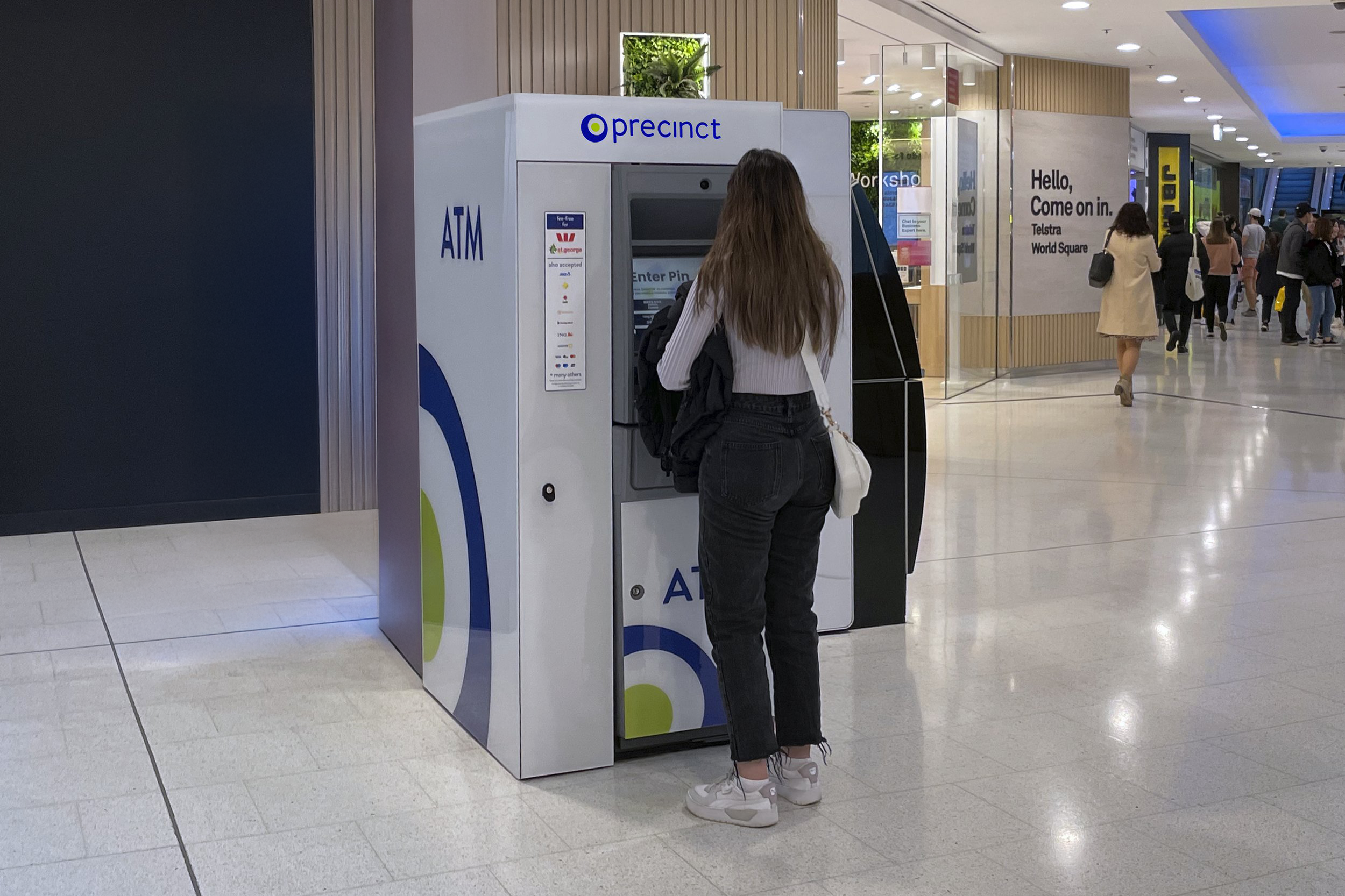
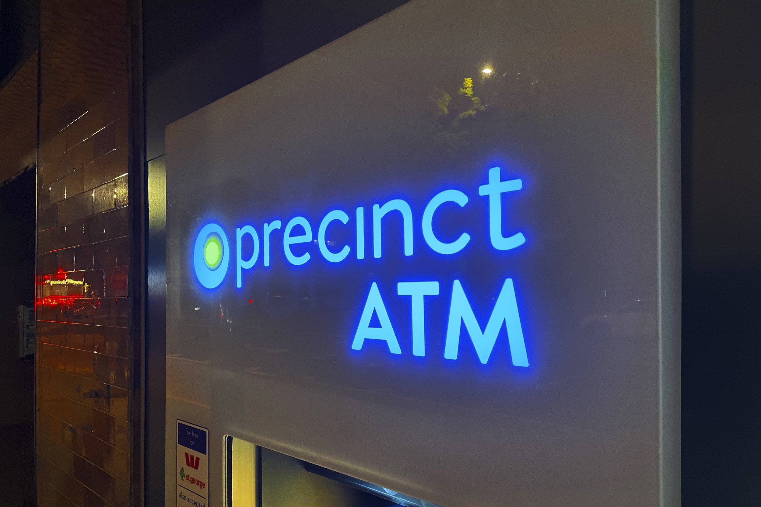
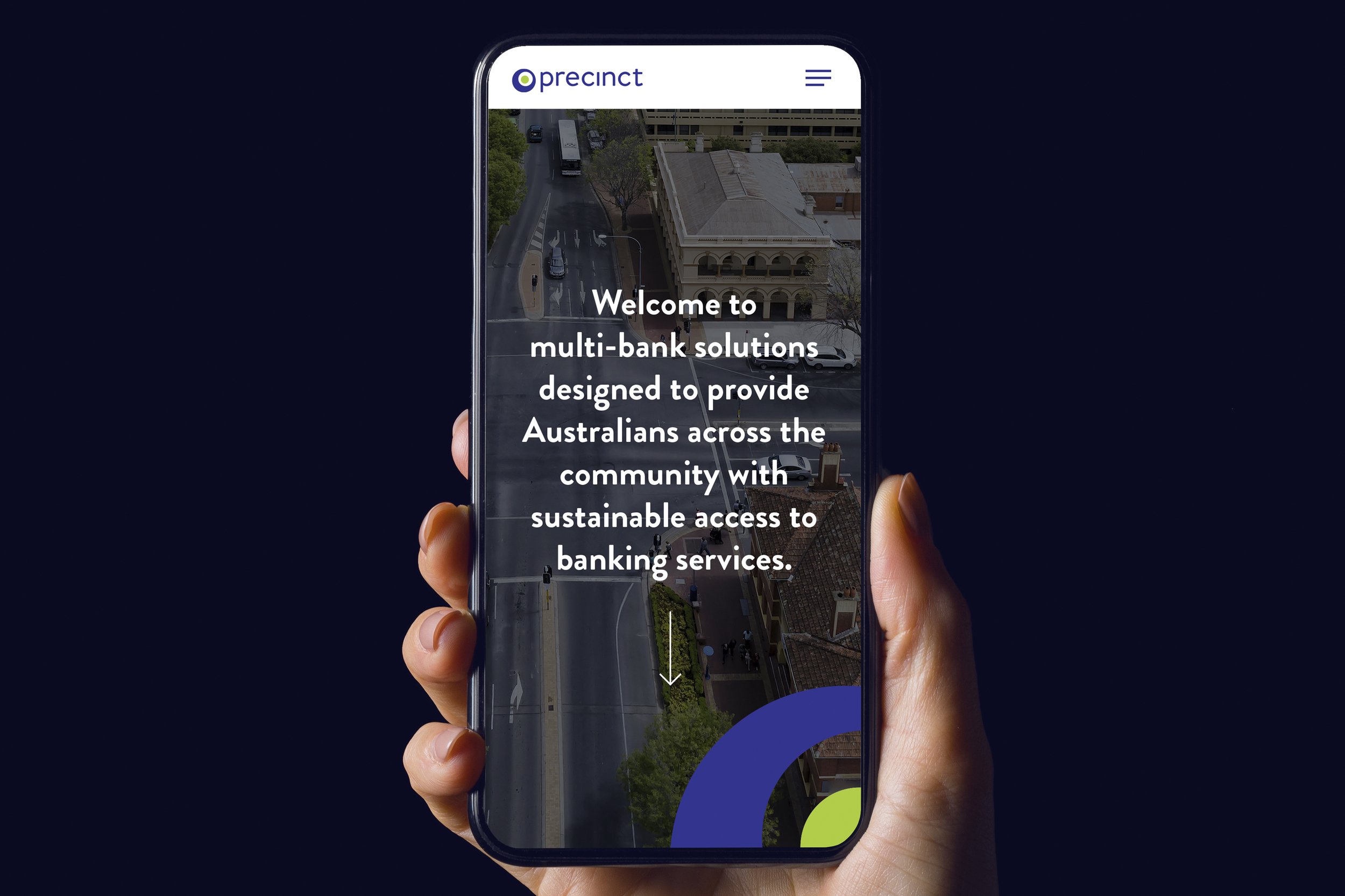
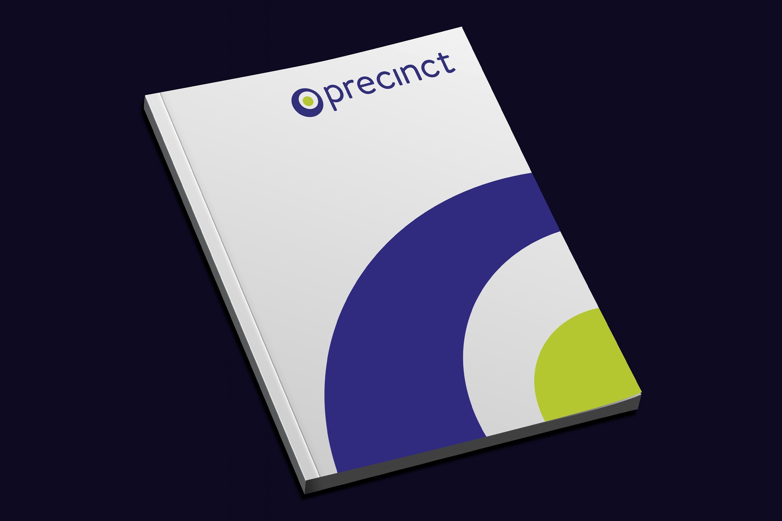


Precinct is a new banking services provider launched by Prosegur. It focuses on delivering multi bank solutions for Australians across the community. We designed a simple, modern identity, expressing the idea of a precinct through two circular graphic devices. The brand identity and design direction were applied to ATMs across Australia and extended throughout the organisation, including social assets and a new website.
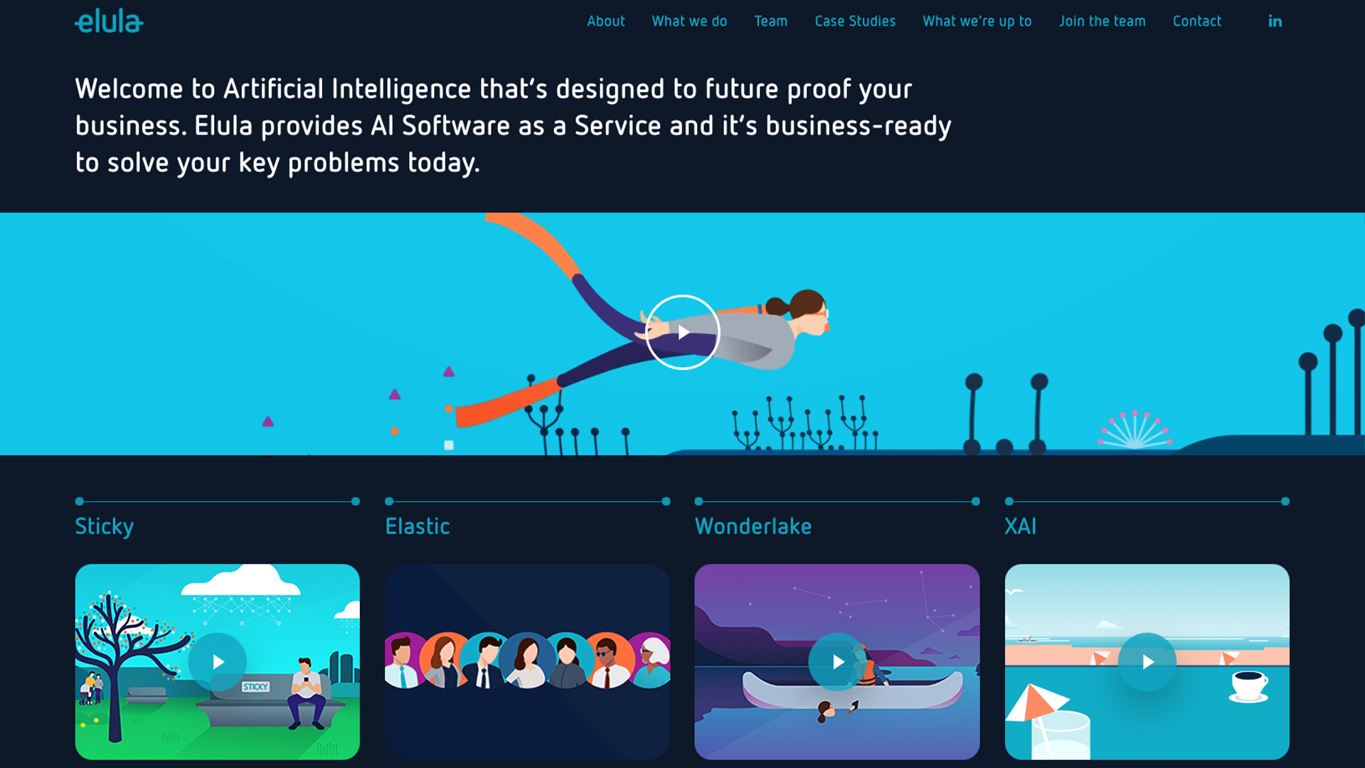
Elula creates AI driven software solutions designed to help organisations unlock insights and make smarter decisions. We built Elula’s website from the ground up. Our team integrated video content and simplified the language to explain the benefits of Artificial Intelligence in a friendly, conversational tone. The site is visually led throughout and covers Elula’s software products in a simple, engaging way. It also features case studies and news, and profiles team members with playful bios.
GenieUs is an Australian medical research organisation using genomic science to unlock new solutions for neurodegenerative diseases. We developed a distinctive brand identity to coincide with its launch. A graphic wave device, inspired by the structure of DNA, forms a central element across all brand assets and reflects the organisation’s drive to discover new breakthroughs.
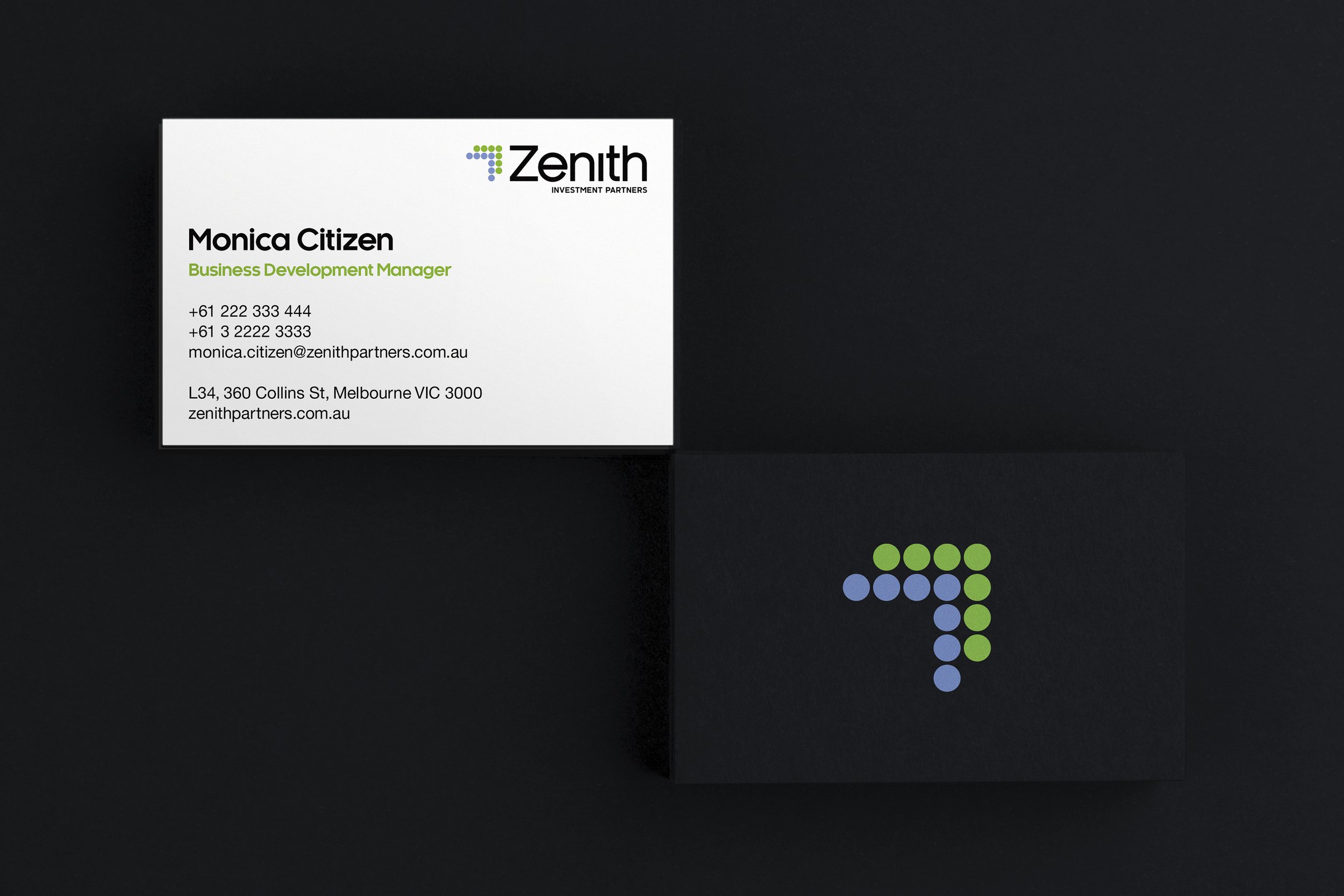
Zenith Investment Partners is a leading provider of investment research and portfolio solutions for financial advisers across Australia. We redesigned their identity and created a suite of new brand assets. The modernised system uses a clean, simple visual approach, with a new logo built around a dotted-arrow device that represents Zenith’s services working together and moving upwards.
Quadrent is a leading equipment finance and lease-portfolio software provider based in Australia and New Zealand. We designed and built the new Quadrent website, making their services easy to navigate through bold visuals and a simple, clear structure. Our work included producing staff photography, integrating Quadrent’s LOIS software into the site and creating an explainer video that summarises key services.
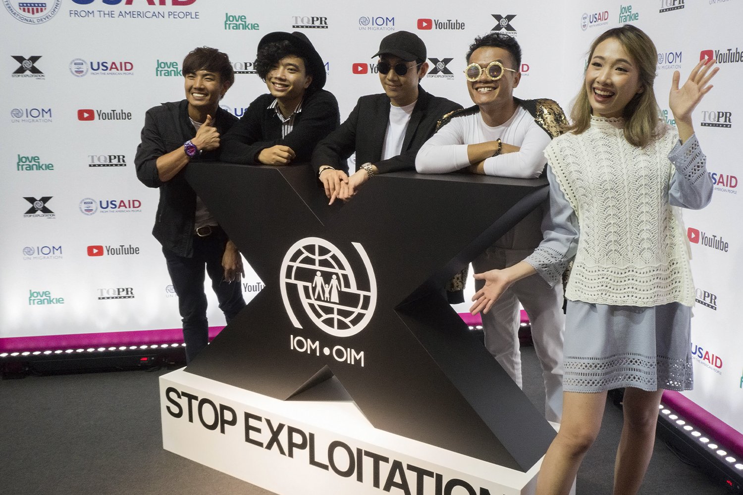
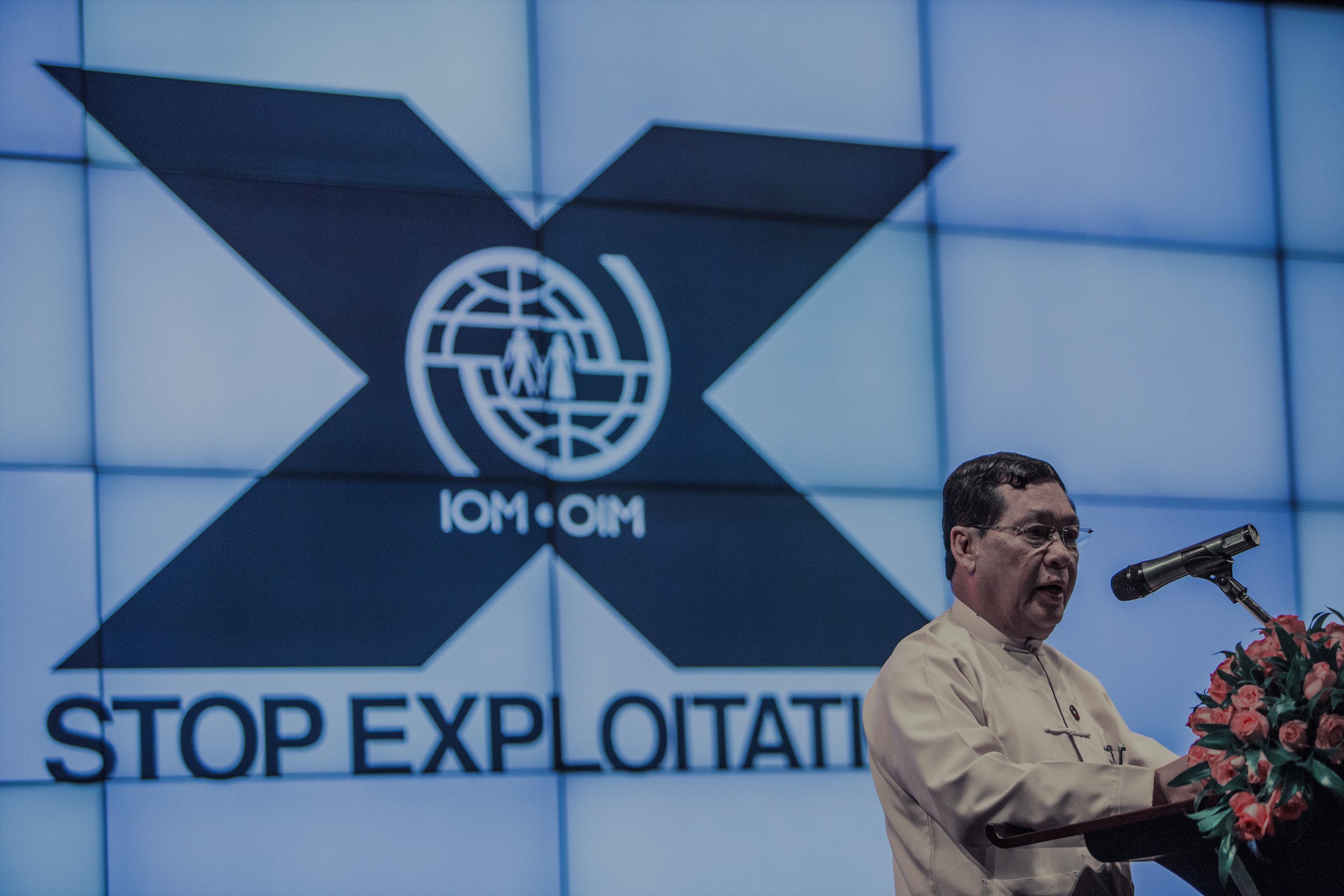
IOM X is the International Organization for Migration’s initiative to encourage safe migration and mobilise public action against exploitation and human trafficking. We designed a new identity for IOM X that delivers a bold, confident expression of its mission. A key challenge was incorporating the existing IOM mark into the refreshed logo. The new design system was rolled out across all IOM X global assets.
Chant West is a trusted Australian superannuation research, data insights and technology company. We created a new brand identity and refreshed their existing ‘apple’ ratings logos, modernising the graphic device used in their long-standing “apples with apples” comparison approach. The design system is built around a clean, contemporary structure that ensures consistency across events, social, print and digital applications.
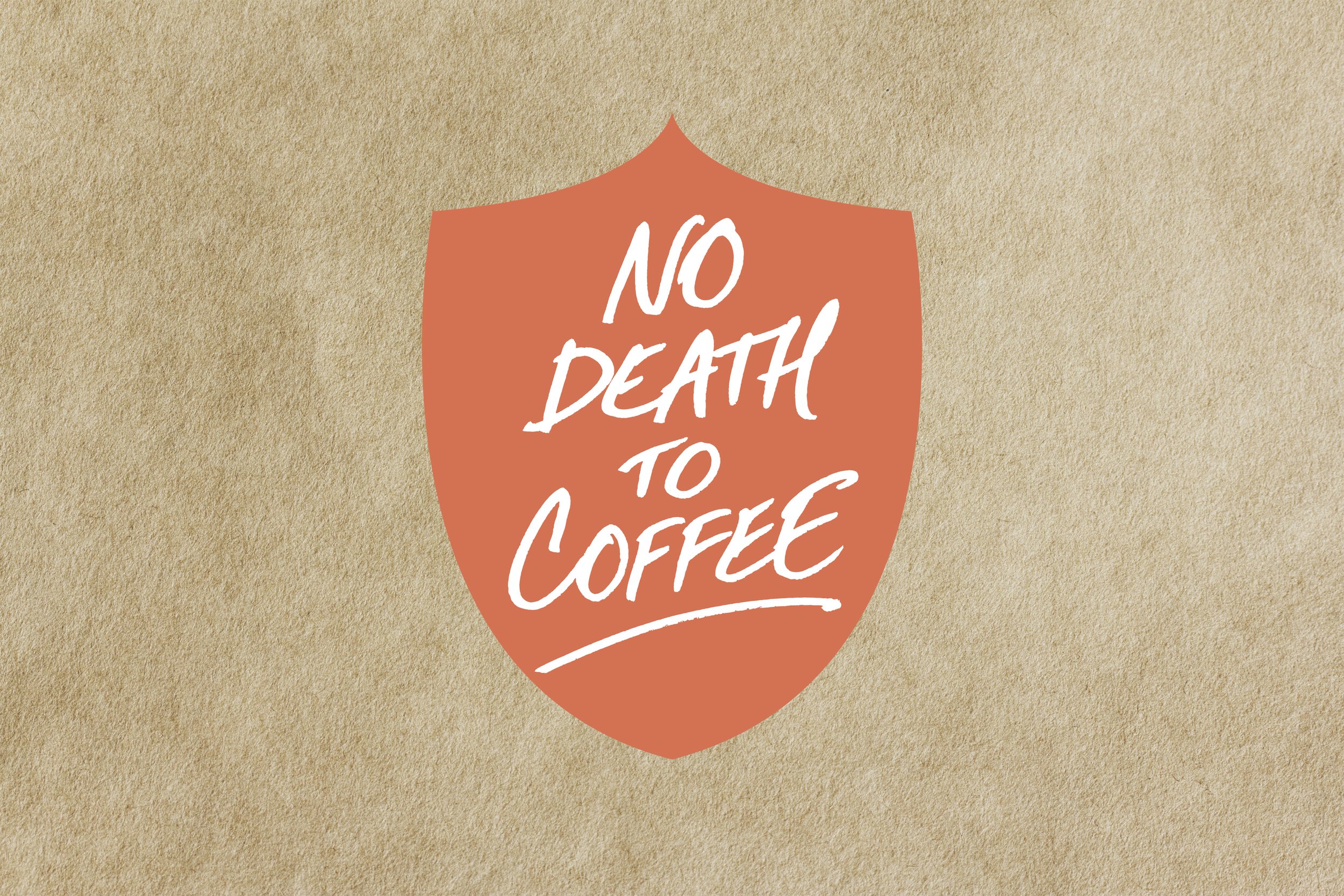
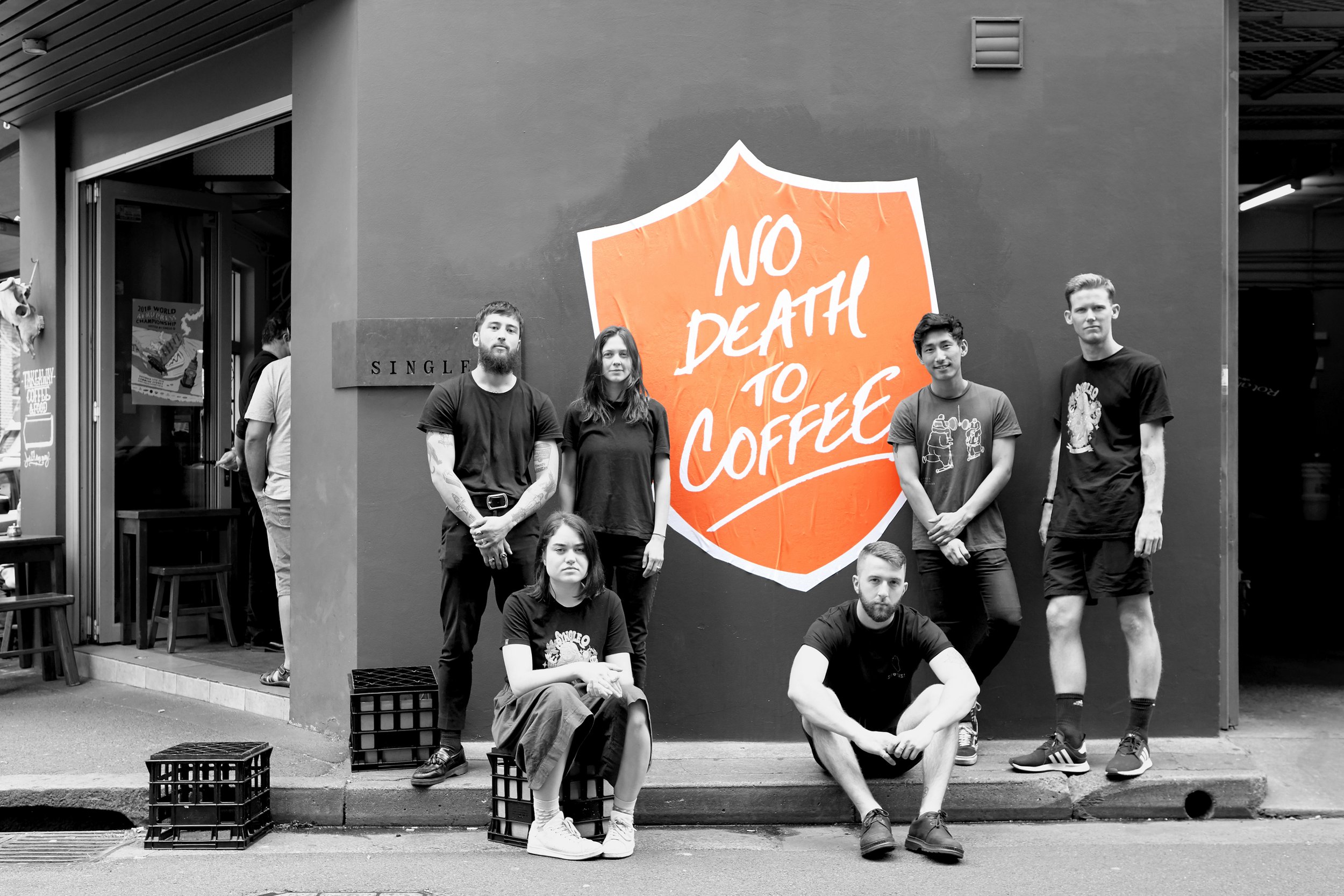
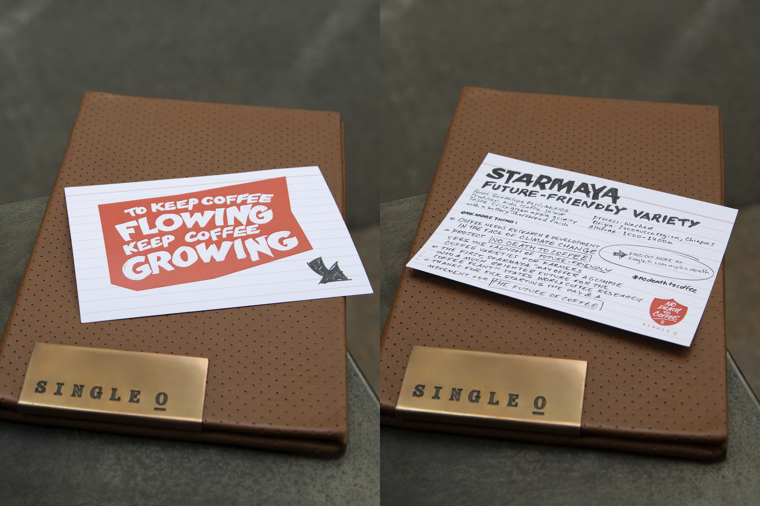
Single O is a specialty coffee roaster and café group founded in Sydney in 2003. Known for sourcing exceptional single-origin beans, roasting them freshly and committing to sustainability, Single O has built a loyal following in Australia and Japan. We created a new visual identity and social content for their climate-resistant coffee range, launching under the rallying cry “No Death to Coffee”.
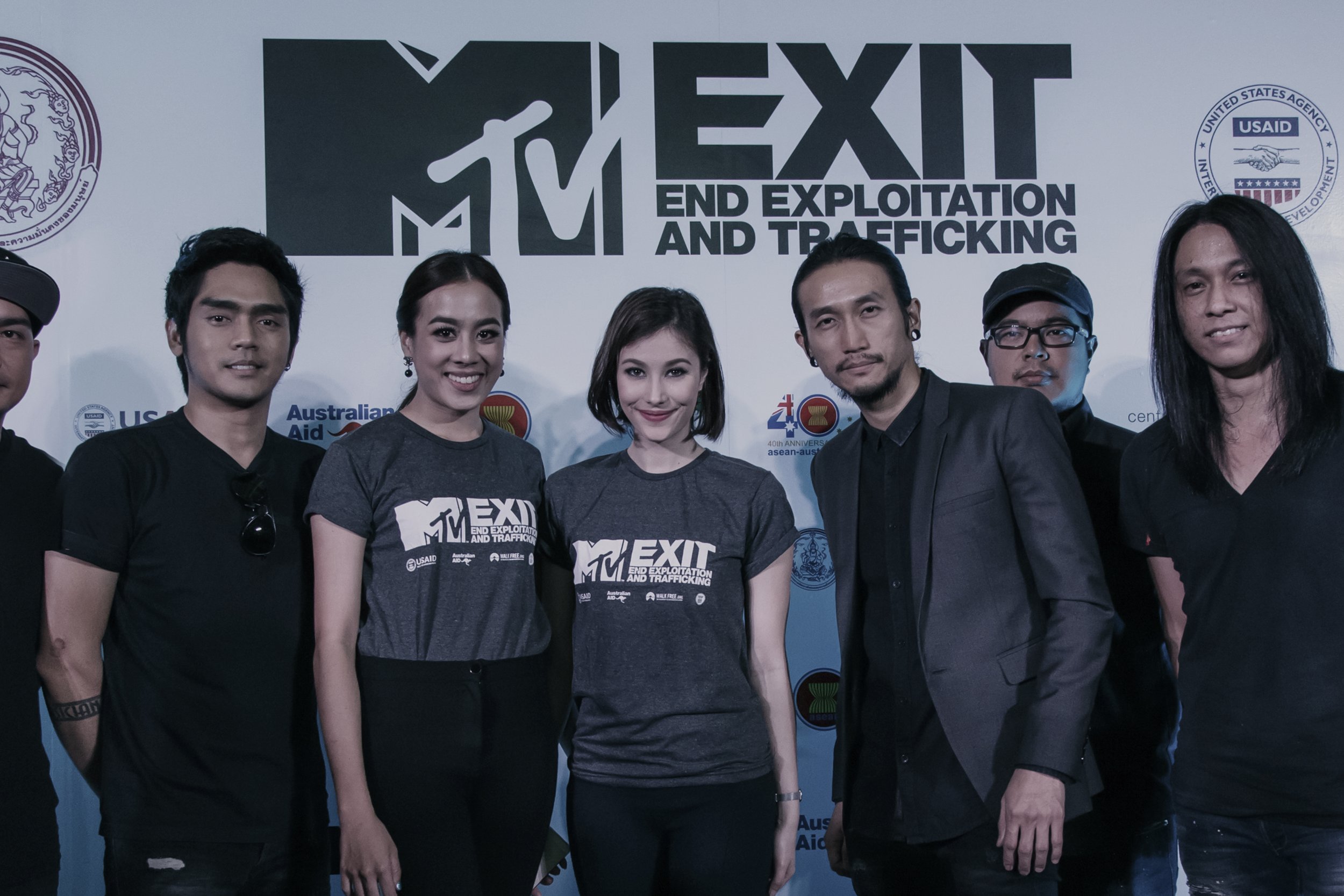
MTV EXIT is an initiative launched by MTV Networks Europe to raise awareness of human trafficking and use the influence of the MTV brand and its global reach to educate young people about the issue. We were briefed to redesign the existing identity across all channels, including on-air, social, events, collateral and advertising. A key design challenge was incorporating the existing MTV logo into the refreshed brand.
Ultima is an Australian sports gear brand focused on youth football apparel. The brand launched with customisable shin guards, allowing players to create their own designs using an online tool. We developed the brand name and design direction ahead of launch, creating a library of graphics and social assets. The new logo and visual system were applied across merchandise, in-store displays and promotional material.
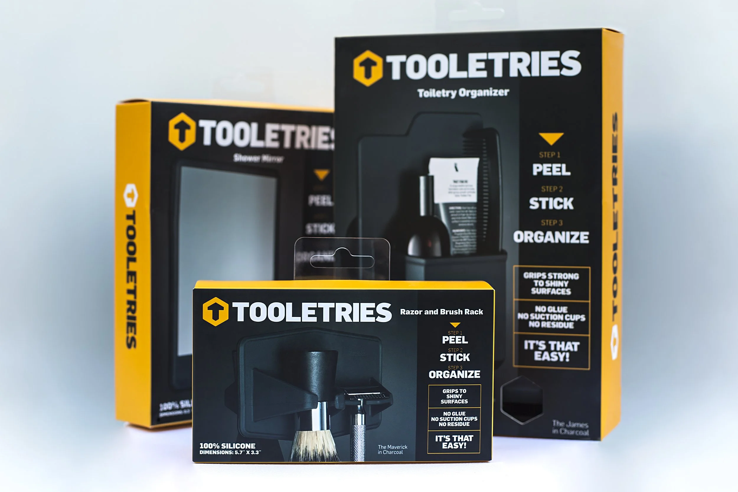
Tooletries is an Australian brand creating modern, functional bathroom storage accessories targeted at men. We updated the Tooletries logo and redesigned the complete packaging range, spanning over 30 products. The system introduces tactile cut-outs that allow customers to touch the silicone products at point of sale, supported by clear front-panel communication of key product attributes. We also produced the product photography, ensuring a cohesive, tool-inspired aesthetic across the entire range.
Artisan Focacceria was a much-loved Sydney café built on traditional Italian food values. The design brief was to create a premium identity with a vintage Italian aesthetic. Our approach balanced old and new, giving Artisan a distinctive identity with a timeless feel. The final design was applied across exterior signage, menus, packaging, coffee cups, stationery and advertising.
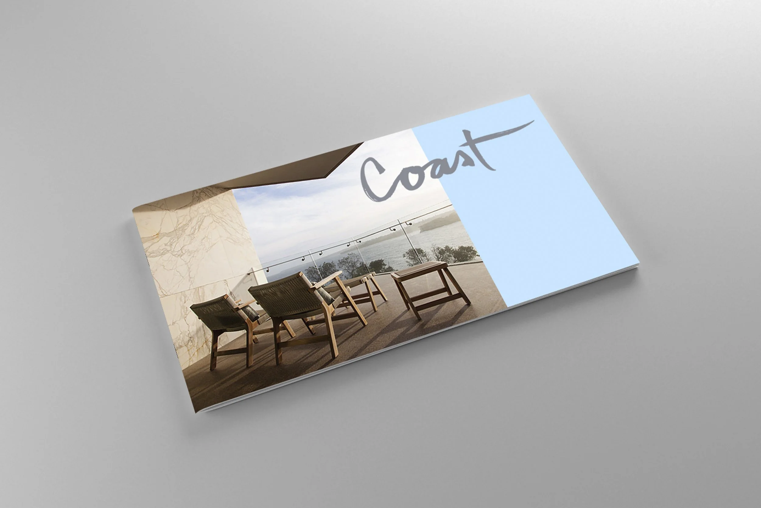
Coast is a luxury residential development located at Ben Buckler in North Bondi, Sydney. The architecture and interiors were designed by SJB, inspired by the casual beach lifestyle of Bondi and expressed through natural materials throughout. We were briefed to create a unique identity aligned with the architects’ vision. Our design approach was organic, using a gentle, flowing calligraphic execution.
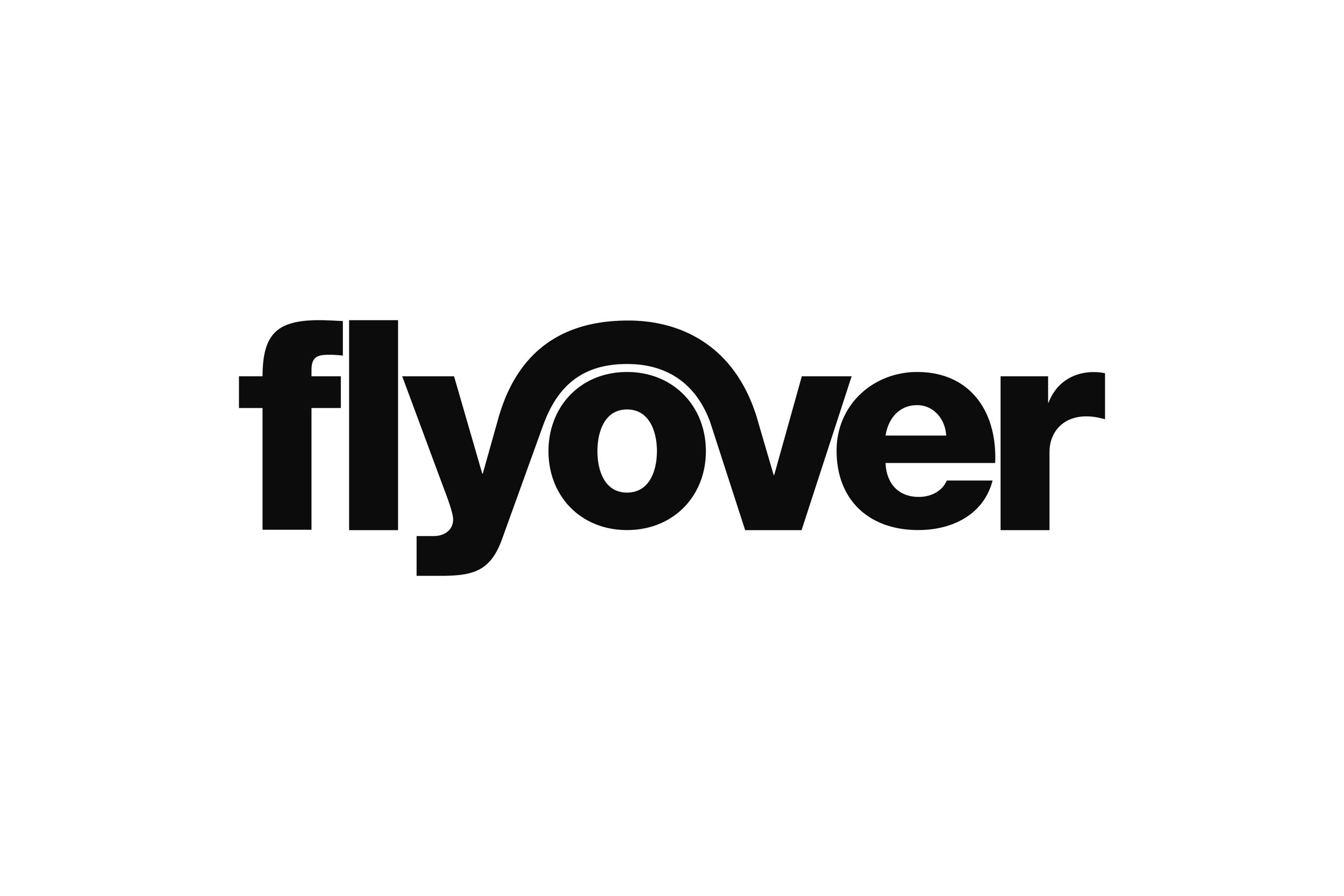
Flyover was a contemporary lounge bar and restaurant serving modern Australian food. Tucked beneath an inner-city overpass, it embraced its unexpected location with a bold, playful identity we created for its launch. The brand system was applied throughout the space, including menus, signage, promotional material, advertising and merchandise.